
Table of Contents
Plotly Course 2024 Introduction
Hello guys welcome to our Plotly Course 2024,
If you haven’t had the pleasure of experiencing Plotly’s magic, you’re in for a treat. Plotly is like having a wand for creating captivating charts and graphs with minimal effort. It’s the secret sauce for turning your data into interactive visual masterpieces.
Becoming a Plotly maestro unlocks a new dimension of understanding your data, and it’s the key to elevating your data storytelling game. In this journey, we’ll plunge headfirst into the enchanting world of Plotly, unveiling its most potent spells (or methods, if you prefer), features, and capabilities.
Assuming you’re already well-versed in the theory of these plots, here’s a sneak peek of what awaits you.
What is plotly for Python?
Plotly for Python is a popular data visualization library that allows Python developers to create interactive and visually appealing graphs, charts, and dashboards. It’s renowned for its user-friendly interface, making it a fantastic tool for data scientists and analysts to represent data in a compelling way.
Is Matplotlib better than plotly?
The choice between Matplotlib and Plotly depends on your specific needs. Matplotlib is a powerful, traditional library with extensive customization options, perfect for static visualizations. On the other hand, Plotly is known for its interactivity, making it a go-to choice for creating dynamic and web-friendly visualizations. The “better” option varies based on the context of your project and personal preferences.
Is plotly free to use?
Plotly offers both free and paid versions. The core Plotly library is open-source and free to use, making it accessible to a wide range of users. However, Plotly also provides commercial services, like Plotly Cloud and Plotly Dash, which offer advanced features and come with subscription fees.
What is the purpose of plotly?
The primary purpose of Plotly is to simplify data visualization in Python. It’s designed to help users create interactive and informative graphs and charts for a wide range of applications, from exploratory data analysis to sharing data-driven insights with others. Plotly’s versatility makes it a valuable tool for conveying complex data in a clear and engaging manner.
Feel free to fork or edit the notebook for your own convenience. If you liked the notebook, consider upvoting. It helps other people discover the notebook as well. Your support inspires me to produce more of these kernel.
import numpy as np
import pandas as pd
import matplotlib.pyplot as plt
import seaborn as sns
import plotly.express as px
import plotly.graph_objects as go
from plotly.subplots import make_subplots
import plotly.figure_factory as ff # for plot heatmap
from plotly.offline import init_notebook_mode
init_notebook_mode(connected=True)
import warnings
warnings.filterwarnings('ignore')
# Iris data available in the plotly express module
df_iris = px.data.iris()
# Stock data available in the plotly express module
df_stocks = px.data.stocks()
# Tips data available in the plotly express module
df_tips=px.data.tips()
# Gapminder data available in the plotly express module
population= px.data.gapminder()
sns.color_palette("Reds_r", 4) # Reds_r is palette and 4 is number of colors, you can change the palette and number of color
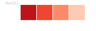
print(sns.color_palette("Reds_r", 4).as_hex()) # if you want to get the color by hexadecimal[‘#bc141a’, ‘#f14432’, ‘#fc8a6a’, ‘#fdcab5’]
Important Plotly Modules
plotly.graph_objects: This module is at the core of Plotly and provides a versatile way to create a wide range of interactive plots and charts.
plotly.express: It’s a simplified, high-level interface for creating Plotly visualizations with minimal code. Great for quick and easy charting.
plotly.subplots: This module enables you to create subplots in a grid, allowing you to display multiple charts in a single figure.
plotly.figure_factory: Useful for creating specific types of charts like tables, heatmaps, and 3D surface plots.
dash: Not a plotting module, but a vital part of Plotly. It’s a Python web application framework for building interactive web-based dashboards with Plotly visualizations.
These modules give you the tools to create a wide range of interactive visuals and web-based applications using Plotly.
Basic Plots
Line Plots
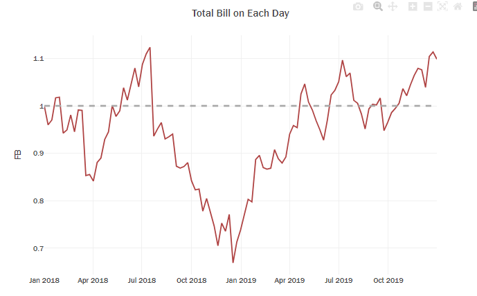
# Exploring Facebook stocks through an interactive line plot
f=px.line(df_stocks, x='date', y='FB')

f.add_hline(y=1, line_width=3, line_dash="dash", line_color="darkgrey")

# decoration
temp = dict(layout=go.Layout(font=dict(family="Franklin Gothic", size=12)))
f.update_traces(line_color='#AF4343')
f.update_layout(title="Total Bill on Each Day", showlegend=True, template=temp,
                  legend=dict(orientation="h", yanchor="bottom", y=1, xanchor="right", x=.97),
                  barmode='group', bargap=.15)
Using Graph Objects for further customizations
- To achieve these kinds of things, we need to use the graph_objects, which is why it was said that we need the graph_objects module for more complex charts and plotly_express for simpler charts.
- Create a figure object using
fig=go.Figure().- To add a plot to the figure use
fig.add_trace()and pass the graph object to the figure object.- Use
go.scatter(x,y,mode)to create graph objects for scatter plots and line plots.- And here we need to use the
modeparameter to specify the plot style, by default it will be assigned to lines which will give a line plot. And for the Facebook, as we gavemode='lines+markers'it will have the lines along with markers for the points, easy styling!- For line styling, use the
lineparameter and assign a dictionary with various stylings you need.Note:
- The
modeproperty is a flaglist and may be specified- as a string containing:
- Any combination of
['lines', 'markers', 'text']joined with+characters (e.g. ‘lines+markers’)- OR exactly one of
['none'](e.g. ‘none’)
# Create a figure object for which we can later add the plots
fig = go.Figure()

# pass the graph objects to the add trace method, assign a series to x and y parameters of graph objects.
fig.add_trace(go.Scatter(x=df_stocks.date, y=df_stocks.AAPL, mode='lines',line_color='#AF4343' ,name='Apple'))
fig.add_trace(go.Scatter(x=df_stocks.date, y=df_stocks.AMZN, mode='lines+markers',line_color='#fcbca2' ,name='Amazon'))

# Customizing a particular line
fig.add_trace(go.Scatter(x=df_stocks.date, y=df_stocks.GOOG,
                        mode='lines+markers', name='Google',line_color='red'  ,
                        line=dict(color='darkgreen', dash='dot')))

# Further style the figure

temp = dict(layout=go.Layout(font=dict(family="Franklin Gothic", size=12)))
fig.update_traces(marker=dict(line=dict(width=1, color='#000000')))
fig.update_layout(title="Total Bill on Each Day", showlegend=True, template=temp,
                  legend=dict(orientation="h", yanchor="bottom", y=1, xanchor="right", x=.97),
                  barmode='group', bargap=.15)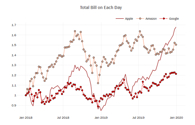
Bar Plots
- Using Plotly Express for simple Bar Plots
- Use
px.bar(data,x,y)to create your bar chart. You can add an extra dimension to the bar plot by simply using the parameter, in that case you will get the stacked bar plot, if you want it side by side, you can change it with the parameterbarmode='group' - Customized Bar Plots
- Instead of directly printing the plotly express object, if we save to figure, then we can make more customizations using the
update_traceandupdate_layoutmethods of the figure.
# Create bar chart
fig=px.bar(df_tips,x="sex",y="tip",title="Sum Of Tips In Each Gender")
# Update marker color
fig.update_traces(marker=dict(color='#AF4343'))

# Show the plot
fig.show()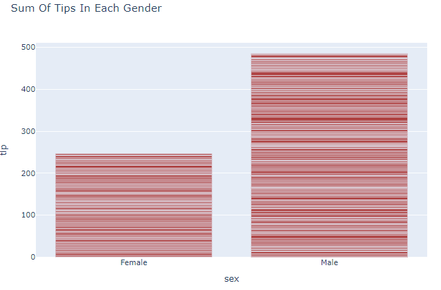
fig=px.bar(df_tips,x="sex",y="tip",color="time",title="Sum Of Tips In Each Gender",
           color_discrete_sequence=px.colors.qualitative.Bold_r)
# Show the plot
fig.show()
fig=px.bar(df_tips,x="sex",y="tip",color="time",title="Sum Of Tips In Each Gender",barmode='group',
           color_discrete_sequence=px.colors.qualitative.Bold_r)
# Show the plot
fig.show()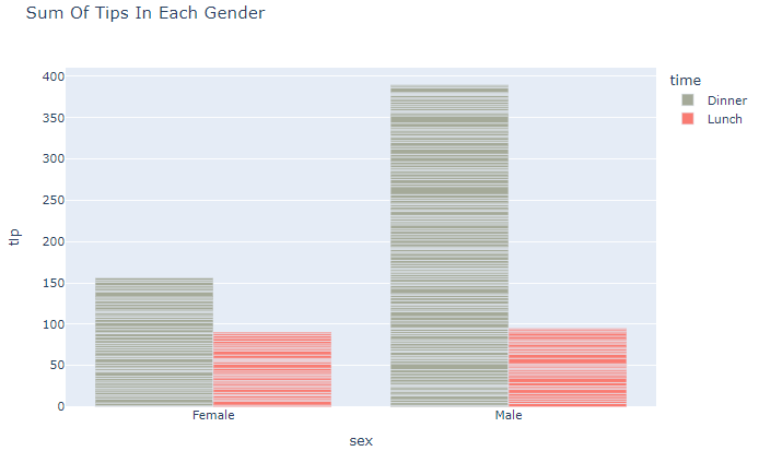
# Customizing Individual Bar Colors
fig = go.Figure(go.Bar(
    x=['Feature A', 'Feature B', 'Feature C','Feature D', 'Feature E'],
    y=[20, 14, 23, 25, 22],
    text=[20, 14, 23, 25, 22],
    marker_color=['lightslategray','crimson','lightslategray','lightslategray','lightslategray']))
    # marker_color can be a single color value or an iterable


temp = dict(layout=go.Layout(font=dict(family="Franklin Gothic", size=12)))
fig.update_traces(texttemplate='%{text}', textposition='outside',
                  hovertemplate='least used %{x} by value = %{y}',
                  marker_line=dict(width=1, color='#28221D'))
fig.update_yaxes(visible=False, showticklabels=False)
fig.update_layout(template=temp, title_text='Least Used Feature',
                  xaxis=dict(title='', tickangle=25, showline=True),
                  height=450, width=700, showlegend=False)
fig.show()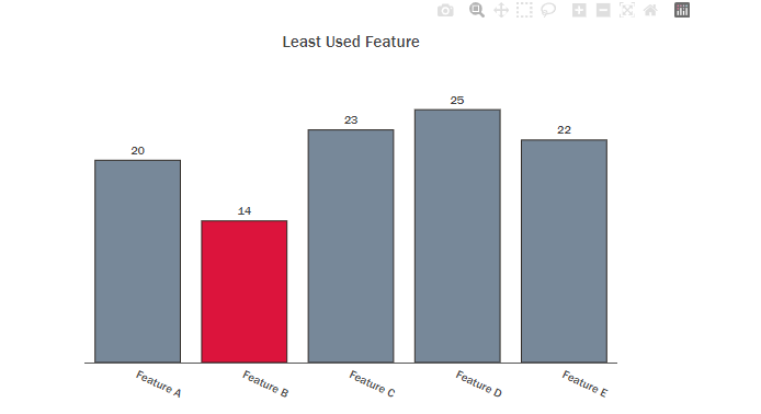
pal = sns.color_palette("Reds_r", 4).as_hex()

fig = px.bar(x=df_tips.day.value_counts().sort_values(ascending=False).index,
             y=df_tips.day.value_counts().sort_values(ascending=False).values,
             text=df_tips.day.value_counts().sort_values(ascending=False).values,
             color=df_tips.day.value_counts().sort_values(ascending=False).index,
             color_discrete_sequence=pal, opacity=0.8)

temp = dict(layout=go.Layout(font=dict(family="Franklin Gothic", size=12)))
fig.update_traces(texttemplate='%{text}', textposition='outside',
                  marker_line=dict(width=1, color='#28221D'))
fig.update_yaxes(visible=False, showticklabels=False)
fig.update_layout(template=temp, title_text='Number of Bill in Each Day',
                  xaxis=dict(title='', tickangle=25, showline=True),
                  height=450, width=700, showlegend=False)
fig.show()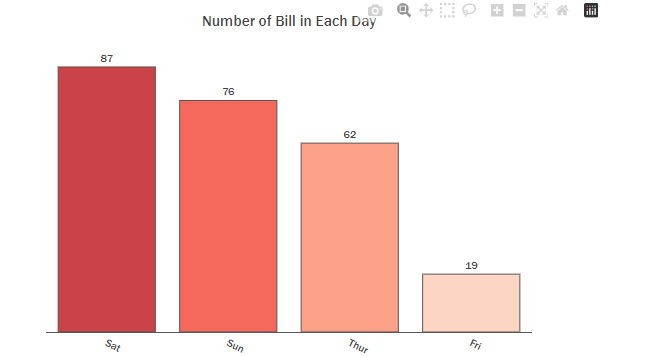
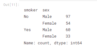
df_tips.groupby(["smoker"])["sex"].value_counts() # = df_tips.groupby(["smoker","sex"])['tip'].count()
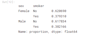
perc_df=df_tips.groupby(["sex"])["smoker"].value_counts(normalize=True) # convert the value percentile
perc_df
x2= ["Female","Male"]
y2_no= list(perc_df[[( 'Female','No'),( 'Male','No')]].values)
y2_yes= list(perc_df[[( 'Female','Yes'),( 'Male','Yes')]].values)
print("x= ",x2,"\n" )
print("y1= ",y2_no,"\n" )
print("y2= ",y2_yes,"\n" )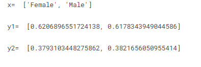
f2=go.Figure()

f2.add_trace(go.Bar(x=x2, y=y2_yes, name='Smokers', text=y2_yes, textposition='outside',
                     texttemplate='%{text:.1f}%', width=0.38,
                     hovertemplate='Proportion of %{x} Smokers = %{y:.4f}%<extra></extra>',
                     marker=dict(color='#AF4343', opacity=0.8)))
f2.add_trace(go.Bar(x=x2, y=y2_no, name='Not Smokers', text=y2_no, textposition='outside',
                     texttemplate='%{text:.1f}%', width=0.38,
                     hovertemplate='Proportion of %{x} Not Smokers = %{y:.4f}%<extra></extra>',
                     marker=dict(color='#C6AA97', opacity=0.8)))


temp = dict(layout=go.Layout(font=dict(family="Franklin Gothic", size=12)))
f2.update_traces(marker=dict(line=dict(width=1, color='#000000')))
f2.update_layout(title="Total Bill on Each Day", showlegend=True, template=temp,
                  legend=dict(orientation="h", yanchor="bottom", y=1, xanchor="right", x=.97),
                  barmode='group', bargap=.15)
f2.update_yaxes(range=(0,1))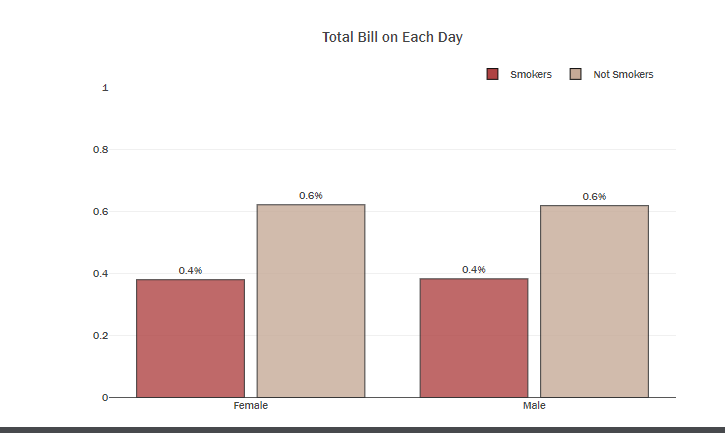
df_tip_day_sex=df_tips.groupby(["day","sex"])["total_bill"].sum()
x_male =list(df_tip_day_sex[[( 'Fri','Male'),('Sat','Male'),('Sun','Male'),('Thur','Male')]])
x_female =list(df_tip_day_sex[[( 'Fri','Female'),('Sat','Female'),('Sun','Female'),('Thur','Female')]])
y=['Fri','Sat','Sun','Thur']
print("df_tip_day_sex \n",df_tip_day_sex,"\n----------------------------------------------------")
print("x_male =",x_male,"\n---------------------------------------------------------------")
print("x_male =",x_female,"\n---------------------------------------------------------------")
print("y =",y)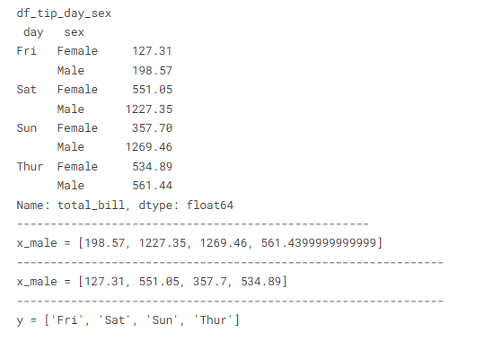
################################ plot by express ####################
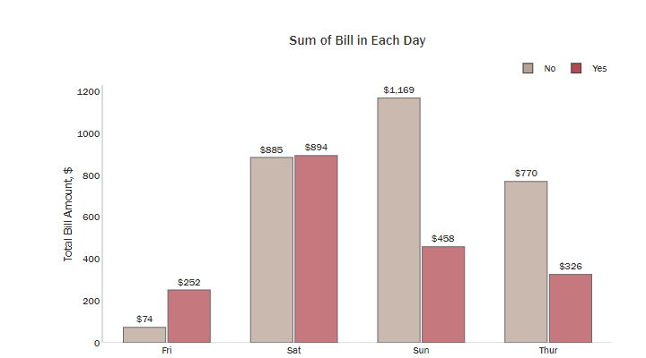
plot_df = df_tips.groupby(['day','smoker'])['total_bill'].sum()
plot_df = plot_df.rename('total_bill').reset_index().sort_values('smoker', ascending=True)
fig = px.bar(plot_df, x='day', y='total_bill', color='smoker', height=500, text='total_bill',
opacity=0.75, barmode='group', color_discrete_sequence=['#B7A294','#B14B51'],
title="Sum of Bill in Each Day")
temp = dict(layout=go.Layout(font=dict(family="Franklin Gothic", size=12)))
fig.update_traces(texttemplate='$%{text:,.0f}', textposition='outside',
marker_line=dict(width=1, color='#303030'))
fig.update_layout(template=temp,font_color="#303030",bargroupgap=0.05, bargap=0.3,
legend=dict(orientation="h", yanchor="bottom", y=1.02, xanchor="right", x=1, title=""),
xaxis=dict(title='Day',showgrid=False),
yaxis=dict(title='Total Bill Amount, $', showgrid=False,zerolinecolor='#DBDBDB',
showline=True, linecolor='#DBDBDB', linewidth=2))
fig.show()
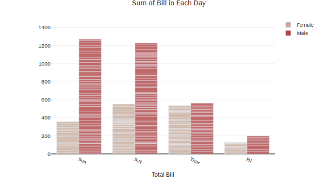
################################ you can drow the same plot by express (very simple) ####################
fig = px.bar(x=df_tips.day,
y=df_tips.total_bill,
color=df_tips.sex,
barmode='group',
color_discrete_sequence=['#C6AA97','#AF4343'], opacity=0.8)
temp = dict(layout=go.Layout(font=dict(family="Franklin Gothic", size=12)))
fig.update_yaxes(visible=True, showticklabels=True,title_text='',range=(0, 1500))
fig.update_layout(template=temp, title_text='Sum of Bill in Each Day',
xaxis=dict(title='Total Bill', tickangle=25, showline=True),
height=450, width=700, showlegend=True,
legend=dict(title=''))
fig.show()
################################ you can drow the same plot by graph_object ####################
fig = go.Figure()
fig.add_trace(go.Bar(y=x_male,x=y, name='Male', text=x_male, textposition='outside',
texttemplate='%{text:.1f}', width=0.38,
hovertemplate='Sum of total bill for man is %{y:.2f}<extra></extra>',
marker=dict(color='#AF4343', opacity=0.8)))
fig.add_trace(go.Bar(y=x_female,x=y ,name='Female', text=x_female, textposition='outside',
texttemplate='%{text:.1f}', width=0.38,
hovertemplate='Sum of total bill for female is %{y:.2f}<extra></extra>',
marker=dict(color='#C6AA97', opacity=0.8)))
temp = dict(layout=go.Layout(font=dict(family="Franklin Gothic", size=12)))
fig.update_yaxes(visible=True, showticklabels=True,title_text='',range=(0, 1500))
fig.update_layout(template=temp, title_text='Sum of Bill in Each Day',
xaxis=dict(title='Total Bill', tickangle=25, showline=True),
height=450, width=700, showlegend=True)
fig.show()
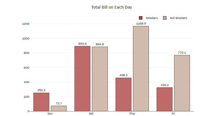
sum_df=df_tips.groupby(["day","smoker"])["total_bill"].sum()
x3= ['Sun', 'Sat', 'Thur', 'Fri']
y3_no= list(sum_df[[( 'Fri','No'),( 'Sat','No'),( 'Sun','No'),( 'Thur','No')]].values)
y3_yes= list(sum_df[[( 'Fri','Yes'),( 'Sat','Yes'),( 'Sun','Yes'),( 'Thur','Yes')]].values)
print("x3= ",x3,"\n" )
print("y3_yes ",y3_yes,"\n" )
print("y3_no ",y3_no,"\n" )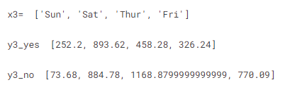
f3=go.Figure()

f3.add_trace(go.Bar(x=x3, y=y3_yes, name='Smokers', text=y3_yes, textposition='outside',
                     texttemplate='%{text:.1f}', width=0.38,
                     hovertemplate='Total Bill is %{y:.3f}<extra></extra> on %{x} ',
                     marker=dict(color='#AF4343', opacity=0.8)))
f3.add_trace(go.Bar(x=x3, y=y3_no, name='Not Smokers', text=y3_no, textposition='outside',
                     texttemplate='%{text:.1f}', width=0.38,
                     hovertemplate='Total Bill is %{y:.3f}<extra></extra> on %{x} ',
                     marker=dict(color='#C6AA97', opacity=0.8)))

temp = dict(layout=go.Layout(font=dict(family="Franklin Gothic", size=12)))
f3.update_traces(marker=dict(line=dict(width=1, color='#000000')))
f3.update_layout(title="Total Bill on Each Day", showlegend=True, template=temp,
                  legend=dict(orientation="h", yanchor="bottom", y=1, xanchor="right", x=.97),
                  barmode='group', bargap=.15)
Scatter Plots
Use px.scatter(data,x,y) to create simple scatter plots. You can add more dimension using color and size parameters. By using the graph object, use go.scatter(data,x,y,mode=’markers’) to create a scatter plot, and we can even add a numeric variable as a dimension with color a parameter.
fig = px.scatter(df_tips, x='total_bill', y='tip', color='smoker', size='size',
                 title="Total Bill with Tip among Smokers",
                 color_discrete_sequence=['#B14B51','#B7A294'],height=600)

temp = dict(layout=go.Layout(font=dict(family="Franklin Gothic", size=12)))
fig.update_layout(template=temp,legend=dict(title='',orientation="h", yanchor="bottom", y=1.02, xanchor="right", x=1),
        font_color="#303030",
        xaxis=dict(title='Total Bill',showgrid=False,zerolinecolor='#E5E5EA',showline=True, linecolor='#E5E5EA', linewidth=2),
        yaxis=dict(title='Tip',showgrid=False,zerolinecolor='#E5E5EA',showline=True, linecolor='#E5E5EA', linewidth=2))
fig.show()
Pie Charts
Use px.Pie(data,values=series_name) to create a pie chart. For further customizations, you can use graph object pie chart with go.Pie() and we use the update_traces of the figure object to customize.
The hover info, text, and pull amount ( which is the same as explode, if you are familiar with seaborn).
- The
'hoverinfo'and'textinfo'property is a flaglist and may be specified as a string containing:- Any combination of
['label', 'text', 'value', 'percent', 'name']joined with'+'characters (e.g. ‘label+text’) - OR exactly one of
['all', 'none', 'skip'](e.g. ‘skip’) - A list or array of the above
- Any combination of
pal = sns.color_palette("mako", 5).as_hex()

fig = px.pie(population, values='pop', names='continent', title='Population of European continent',color_discrete_sequence=pal)

fig.update_traces(hoverinfo='label+percent', textfont_size=15,
                  textinfo="label+percent ", pull=[0.05, 0, 0, 0, 0],
                  marker_line=dict(color="#FFFFFF", width=2))

temp = dict(layout=go.Layout(font=dict(family="Franklin Gothic", size=12)))
fig.update_layout(template=temp, title='Target Distribution',
                  uniformtext_minsize=15, uniformtext_mode='hide',width=800)
fig.show()
fig=go.Figure()
target=df_tips.smoker.value_counts(normalize=True)[::-1]
text=['State {}'.format(i) for i in target.index]
color,pal=['#38A6A5','#E1B580'],['#88CAC9','#EDD3B3']
if text[0]=='State 0':
    color,pal=color,pal
else:
    color,pal=color[::-1],pal[::-1]


fig.add_trace(go.Pie(labels=target.index, values=target*100, hole=.5,
                     text=text, sort=False, showlegend=False,
                     marker=dict(colors=pal,line=dict(color=color,width=2)),
                     hovertemplate = "State %{label}: %{value:.2f}%<extra></extra>"))

temp = dict(layout=go.Layout(font=dict(family="Franklin Gothic", size=12)))
fig.update_layout(template=temp, title='Target Distribution',
                  uniformtext_minsize=15, uniformtext_mode='hide',width=700)
fig.show()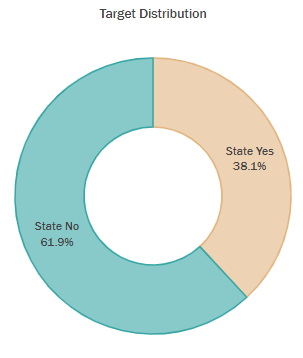
Histograms
Use px.histogram(values) to create a histogram, and you can stack another histogram on top of that using the color parameter. And here is an amazing with histogram plots, you can use marginal parameter to add a layer of another plot on the top, such as box, violin, or rug.
# Stack histograms based on different column data
fig = px.histogram(df_tips, x="total_bill", color="sex",color_discrete_sequence=['#508B8D', '#F0CABD'],barmode='overlay')
#fig.update_layout(bargap=0.2)
temp = dict(layout=go.Layout(font=dict(family="Franklin Gothic", size=12)))
fig.update_layout(template=temp, title_text='Sequence of Total Bill',
                  xaxis=dict(title='', tickangle=25, showline=True),legend=dict(title=''))
fig.show()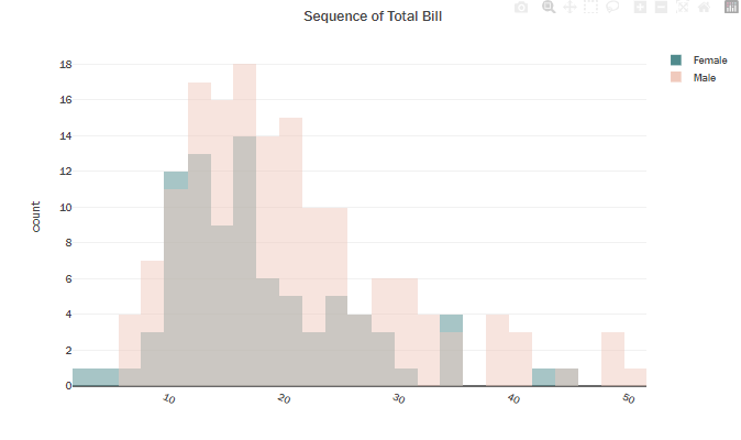
# Stack histograms based on different column data
fig = px.histogram(df_tips, x="total_bill", color="sex", marginal='violin',color_discrete_sequence=['#508B8D', '#F0CABD']
                  ,barmode='overlay')
fig.update_layout(bargap=0.2)

temp = dict(layout=go.Layout(font=dict(family="Franklin Gothic", size=12)))
fig.update_layout(template=temp, title_text='Sequence of Total Bill',
                  xaxis=dict(title='', tickangle=25, showline=True),legend=dict(title=''))
fig.show()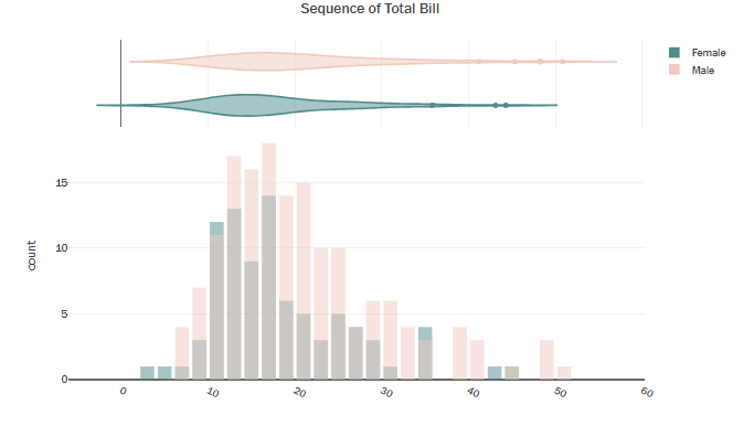
Advanced Plots
Box Plot
Use px.box(data,x,y) to create the box plot, you can use the color parameter to add another dimension for the box plot. And using the points='all' parameter will show all the points scattered to the left. On hover, you can see the quartile values.
You can do further customizations using go.Box(x,y), Using that you can also add mean and standard deviation with the parameter boxmean='sd' .
f=px.box(df_tips,x='tip',y='smoker',color='sex',#box=True,
hover_data=df_tips.columns, # when you hover on the points, all columns inforemation will be appered not just x and y columns
color_discrete_sequence=['#508B8D', '#F0CABD'])


temp = dict(layout=go.Layout(font=dict(family="Franklin Gothic", size=12)))
f.update_traces(marker=dict(line=dict(width=1, color='#000000')))
f.update_layout(title="Tip of Smokers by Box Plot", showlegend=True, template=temp,
                  legend=dict(title="",orientation="h", yanchor="bottom", y=1, xanchor="right", x=.97), bargap=.15)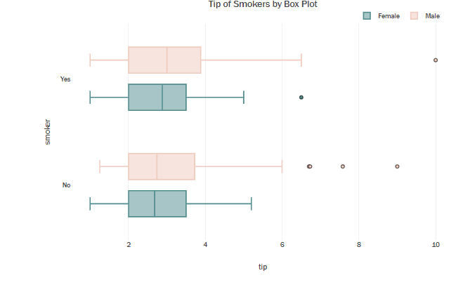
Violin Plot
Use px.violin(data,x,y) to create violin plots. By just giving y parameters you can create a violin plot for one numeric variable. But if you want to create violin plots for a numeric variable based on a category column, then you can specify the category column in the x parameter. And additionaly you can add one more category column dimension using the color parameter. Use box=True parameter to show the box in the plot.
f=px.violin(df_tips,x='tip',y='smoker',color='sex',box=True,
            hover_data=df_tips.columns, #
            color_discrete_sequence=['#508B8D', '#F0CABD'])


temp = dict(layout=go.Layout(font=dict(family="Franklin Gothic", size=12)))
f.update_traces(marker=dict(line=dict(width=1, color='#000000')))
f.update_layout(title="Tip of Smokers by Box Plot", showlegend=True, template=temp,
                  legend=dict(title="",orientation="h", yanchor="bottom", y=1, xanchor="right", x=.97),bargap=.15)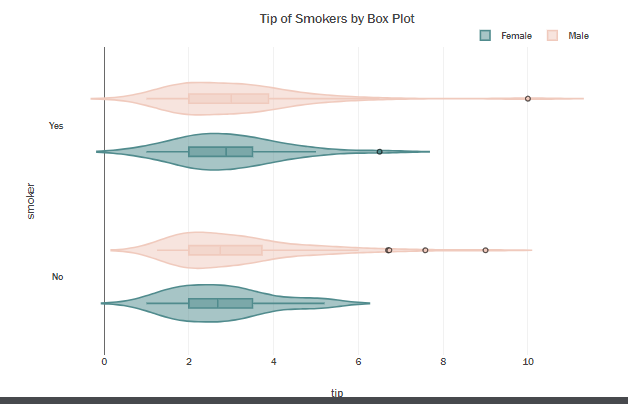
Density Heatmap
If you need to do an analysis for three variables, you can easily opt for the density heatmaps. Use px.density_heatmap(data,x,y,z) to create a density heat map.
f=px.density_heatmap(df_tips, x="total_bill",y="tip",z="size",nbinsx=30, nbinsy=30,
    color_continuous_scale=px.colors.sequential.BuGn)
temp = dict(layout=go.Layout(font=dict(family="Franklin Gothic", size=12)))
f.update_layout(title="Tip vs Total Tip", template=temp)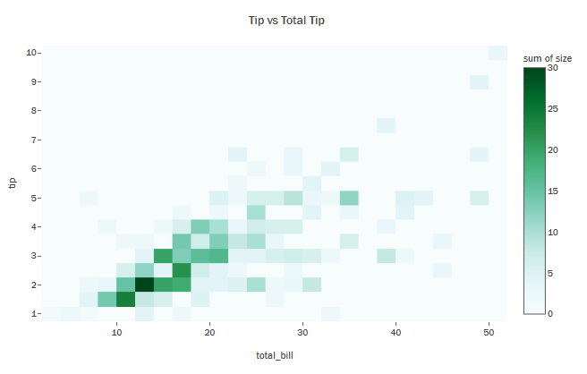
f=px.density_heatmap(df_tips, x="total_bill",y="tip",z="size",nbinsx=30, nbinsy=30, marginal_x='histogram',
                   marginal_y='histogram', color_continuous_scale=px.colors.sequential.Blugrn_r)
temp = dict(layout=go.Layout(font=dict(family="Franklin Gothic", size=12)))
f.update_layout(title="Tip vs Total Tip", template=temp)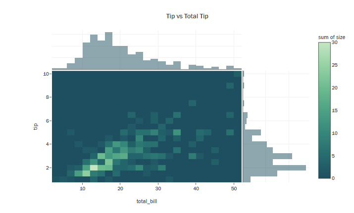
References:
thank you for reading to the end, your advice and comments are important to me. Don’t forget to upvote this notebook if you like it! ❤️
Learn more


1 Comment
Machine Learning Project 1: Honda Motor Stocks Best Prices · May 23, 2024 at 6:38 pm
[…] Plotly Course […]