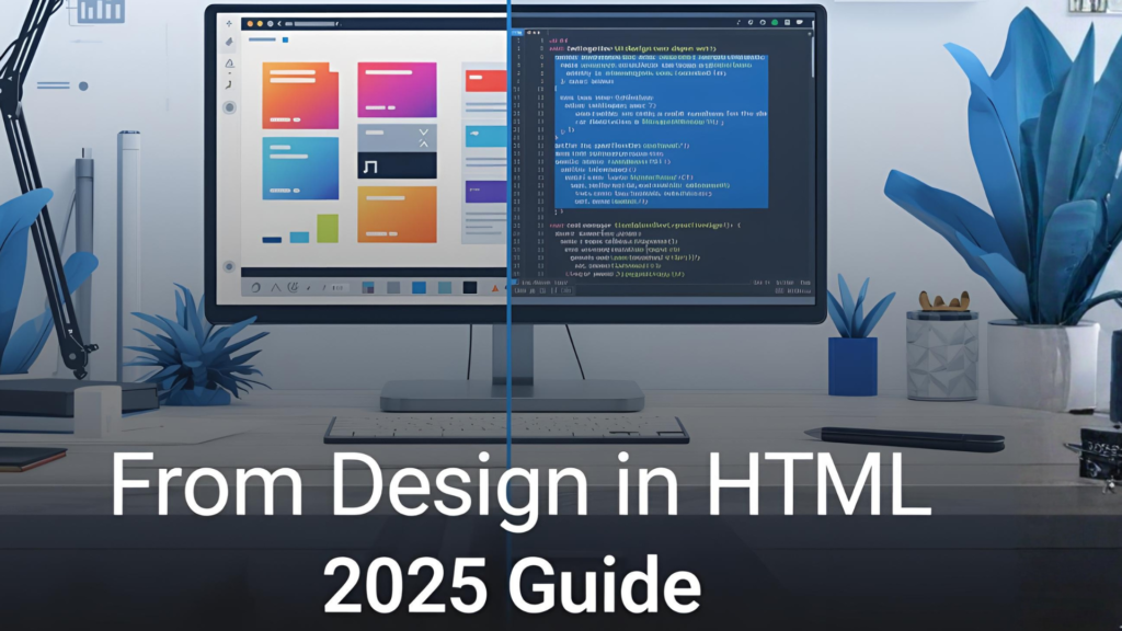
In today’s fast-moving web world, being able to go from design in HTML is more than just a skill—it’s a competitive advantage. Whether you’re converting a Figma mock-up into a full HTML page, refining a UI kit into production-ready markup, or collaborating across design and development teams, this article gives you the step-by-step roadmap you need for 2025.
Let’s dive in, so by the end you’ll confidently navigate the process of turning a design into clean, efficient HTML—and bridge the gap between visual concept and live web page.
Why “from design in HTML” matters in 2025
- Design-Developer handoff is still a pain point. Many teams struggle with miscommunication: designers hand over static files, developers struggle with implementation. A clear workflow—going from design in HTML—reduces friction.
- Responsive demands have grown. With an array of screen sizes and devices, turning a fixed design into fluid HTML/CSS is increasingly essential. (w3schools.com)
- Low-code and design-to-code tools are gaining ground. Tools that convert UI designs into HTML or components are becoming mature, hinting at where “from design in HTML” may evolve. (teleporthq.io)
- Accessibility and performance remain key. Ensuring that the HTML you output from a design is semantic, performant, and accessible is no longer optional—it’s critical.
Thus, mastering a workflow that starts with the design and ends with optimized HTML is a valuable asset for both beginners and seasoned professionals.
The Workflow: Going from Design to HTML
Here’s a structured workflow you can follow to go from design in HTML efficiently.
Step 1 – Review the Design & identify components
- Open the visual design (e.g., in Figma, Sketch, Adobe XD).
- Break it into logical components: header, hero section, cards, footer, etc.
- Use a checklist:
- Fonts and typography
- Color palette
- Spacing and layout grids
- Interactive elements (buttons, links)
- Document responsive breakpoints (mobile, tablet, desktop).
Taking this step ensures you won’t start coding blind.
Step 2 – Set up your HTML skeleton
Create a basic HTML page:
<!DOCTYPE html>
<html lang="en">
<head>
  <meta charset="UTF-8">
  <meta name="viewport" content="width=device-width, initial-scale=1.0">
  <title>Page Title</title>
  <link rel="stylesheet" href="styles.css">
</head>
<body>
  <!-- main content -->
</body>
</html>
- Note the
viewportmeta tag to ensure responsiveness. (w3schools.com) - Use semantic elements like
<header>,<nav>,<main>,<section>,<footer>.
Step 3 – Build out components in HTML & CSS
- Start with structure (HTML): mark up components identified in step 1.
- Then build the styles (CSS) for typography, layout, spacing.
- Use mobile-first approach: write base styles for mobile, then use media queries.
- Example snippet:
<section class="hero">
  <h1>Your Big Headline</h1>
  <p>Subheadline goes here.</p>
  <a href="#" class="btn btn-primary">Get Started</a>
</section>
CSS

.hero {
  padding: 2rem 1rem;
  text-align: center;
}
.btn-primary {
  background-color: #007bff;
  color: white;
  padding: 0.75rem 1.5rem;
  text-decoration: none;
  border-radius: 4px;
}
@media (min-width: 768px) {
  .hero {
    padding: 4rem 2rem;
  }
}
Step 4 – Ensure responsiveness and accessibility
- Use media queries to adjust layout across breakpoints.
- Use semantic markup and
ariaattributes where needed (for interactive elements). - Validate with tools (e.g., Lighthouse, axe) to ensure accessibility.
- Use responsive images (
<picture>element orsrcset) to optimize for different devices. (w3schools.com)
Step 5 – Test and iterate
- Cross-browser testing: Chrome, Firefox, Safari, Edge.
- Device testing: Mobile (portrait/landscape), tablets, desktops.
- Performance check: Minify CSS/JS, compress images.
- UX check: Hover states, keyboard navigation, focus states.
- Feedback cycle: Get designers/developers to review for fidelity to the original design.
Expert Advice & Practical Examples
Expert tips
- Use a design system or component library: If your organization has one, reuse components to save time and maintain consistency.
- Name classes logically: Use BEM (Block Element Modifier) or similar methodology to keep HTML readable and maintainable.
- Keep markup lean: Avoid deep nesting of divs. Use semantic HTML.
- Consider progressive enhancement: Build for the baseline experience first.
- Use design-to-code tools as assistants—not replacements: Tools that convert design into HTML help, but always clean the generated output. (teleporthq.io)
Practical example: Card component
Design: A card with an image, title, text, and a call-to-action.
HTML:
<article class="card">
  <img src="card-image.jpg" alt="Descriptive alt text">
  <div class="card-content">
    <h2 class="card-title">Card Title</h2>
    <p class="card-text">Short description goes here.</p>
    <a href="#" class="btn btn-secondary">Learn More</a>
  </div>
</article>
CSS:
.card {
  border: 1px solid #ddd;
  border-radius: 8px;
  overflow: hidden;
  display: flex;
  flex-direction: column;
}
.card img {
  width: 100%;
  height: auto;
}
.card-content {
  padding: 1.5rem;
}
.btn-secondary {
  background-color: #6c757d;
  color: white;
  display: inline-block;
  margin-top: 1rem;
  padding: 0.5rem 1rem;
  text-decoration: none;
  border-radius: 4px;
}
@media (min-width: 768px) {
  .card {
    flex-direction: row;
  }
  .card img {
    width: 40%;
  }
  .card-content {
    padding: 2rem;
  }
}
This scalable component can be reused throughout your site.
Fresh Insights & Less-Explored Angles
The “design in HTML” mindset shift
Rather than thinking of HTML as simply a “container for styled content,” shift to view it as part of the design system. Building HTML early can influence design decisions—spacing, layout constraints, accessibility considerations—from the start.
Bridging design and code with live collaboration
In 2025, many teams are moving to real-time design + code review workflows:
- Designers annotate directly in prototypes with CSS variables, tokens and layout constraints.
- Developers stub out HTML components early and embed them in design previews.
This tight feedback loop helps shorten the “from design in HTML” timeline.
Future-proofing: CSS container queries & component-driven design
As CSS evolves, container queries and component-scoped styling reduce reliance on global media queries. If you target “from design in HTML” workflows, consider how your HTML components might support container queries, making them even more modular and responsive.
Listicle — 7 Common Mistakes When Converting Design Into HTML
- Skipping semantic HTML (e.g., using
<div>everywhere instead of<section>,<article>). - Not accounting for responsive breakpoints in the design handoff.
- Leaving inline styles or design tool artifacts in production.
- Failing to test accessibility (keyboard navigation, screen readers).
- Over-nesting elements and making the DOM overly complex.
- Ignoring performance (unoptimized images, large CSS bundles).
- Relying entirely on “design-to-code” tools without manual cleanup.
Comparison Table — Manual HTML Vs Auto Design-To-Code Tools
| Feature | Manual HTML Approach | Design-to-Code Tool Approach |
|---|---|---|
| Control over markup | High – you craft everything | Moderate – tool generates, you clean up |
| Fidelity to design | Dependent on developer discipline | Good initial fidelity, may require fixes |
| Responsiveness & performance | You optimize manually | Tool may produce generic code needing optimization |
| Accessibility | You ensure semantics & ARIA | Tool may neglect some accessibility concerns |
| Iteration speed | Slower due to manual coding | Faster prototyping, but cleanup may cost time |
FAQs — Frequently Asked Questions
Q1: Do I need to know a design tool (Figma/Sketch) to go from design in HTML?
A1: Yes—having familiarity with design tools helps you accurately understand layout, spacing, and styles. But core HTML/CSS skills remain foundational.
Q2: Can I skip manual HTML if I use an auto-convert tool?
A2: While design-to-code tools can bootstrap HTML, manual refinement is still needed for semantics, performance, and maintainability.
Q3: How do I maintain consistent design tokens across design and HTML?
A3: Define variables in both your design system and CSS (e.g., --primary-color, --font-size-base), and reference them in code and design. This alignment ensures that when design changes, HTML reflects it smoothly.
Q4: What is the best way to link this post to other content on our site?
A4: You can link to related internal content such as your “CSS Grid Tutorial” or “Responsive Web Design Best Practices” pages using anchor text like “responsive web design tutorial” or “CSS grid guide”.
Conclusion & Call to Action
Turning a visual design into optimized HTML—from design in HTML—is one of the most pragmatic skills in modern web development and design collaboration. By following the workflow above, applying expert advice, avoiding common pitfalls, and embracing future-ready thinking, you elevate not just your code but the user experience and team workflow.
Ready to take action? Download our free component boilerplate, try converting one of your existing designs into HTML today, and let us know your results in the comments below. Share this post with your team, explore our related articles on responsive design and CSS layout, and let’s build smarter together!
👉 What design-to-HTML challenge are you facing right now? Drop it in the comments—let’s solve it together!
Learn more


0 Comments